|
|
Post by mika on Apr 2, 2024 22:22:54 GMT -5
|
|
|
|
Post by mika on Apr 2, 2024 22:32:11 GMT -5
Each successive album has been a bigger let down. Not looking forward to this. I am sad for you, but hoping for the best.  I do hope you will find the same satisfaction as I do. I cannot find the same depth in the solos as in Sucks to be you. However...if not, someone does not look the melodic solos in the way of the songs as I do. These things in Accept's music have always played a very important role of their music to me....since 1980's. A fact: there are not so many bands in the world that are able to born totally new things. But keep on looking and maybe you will find the same happiness as I have.  I love Accept. |
|
mf
Sweet Little Child

Posts: 17
|
Post by mf on Apr 3, 2024 7:09:04 GMT -5
I must again say: there are only two songs released...The record company does not alwaya do the right choices. For examples my absolute fave songs from TMTD album are: Sucks to be You and The Best Is Yet To Come. Thses songs were not released as singles. My favourites were The Undertaker ( great different Song), Sucks To Be You, No One's Master ( sounds right off RR) and Not My Problem ( underrated Heavy Rock song with a fantastic solo) . I read that the new Song "Frankenstein Will be a highlight", there Will be a ballad, Straight Up Jack Will be a Hard Rock kinda Song, Man Up Classic Accept with gang vocals etc. I cannot wait |
|
|
|
Post by Tomcat on Apr 4, 2024 3:33:42 GMT -5
Oops... Wrong thread |
|
|
|
Post by Tomcat on Apr 4, 2024 3:46:11 GMT -5
I must again say: there are only two songs released...The record company does not alwaya do the right choices. For examples my absolute fave songs from TMTD album are: Sucks to be You and The Best Is Yet To Come. Thses songs were not released as singles. True... but in their golden era there were no weak songs... At least in my eyes the time from Breaker to Russian Roulette was a glorious ride without any fillers. |
|
|
|
Post by John on Apr 4, 2024 7:59:16 GMT -5
remember that we are all older now and have heard so much music by so many bands since the golden era of Accept existed. maybe we are not as easy to impress anymore, although i am finding some of the music from a few of the younger bands getting better and they are definitely catching my attention. so it can be done, it's just not as easy as it was back in the day.
|
|
azwayne
Way Of Life
 I'm a madman...
Posts: 2,068
|
Post by azwayne on Apr 5, 2024 12:52:36 GMT -5
Mika: I don't compare to other albums. I judge by the likelihood that I'm going to want to listen to the songs repeatedly. There was much raving about Undertaker, for example, but I found the song tedious and somewhat poorly constructed.
|
|
u94
Freelance Man
Posts: 59 
|
Post by u94 on Apr 8, 2024 5:19:54 GMT -5
Anybody else think the boxset art is way better than the original? 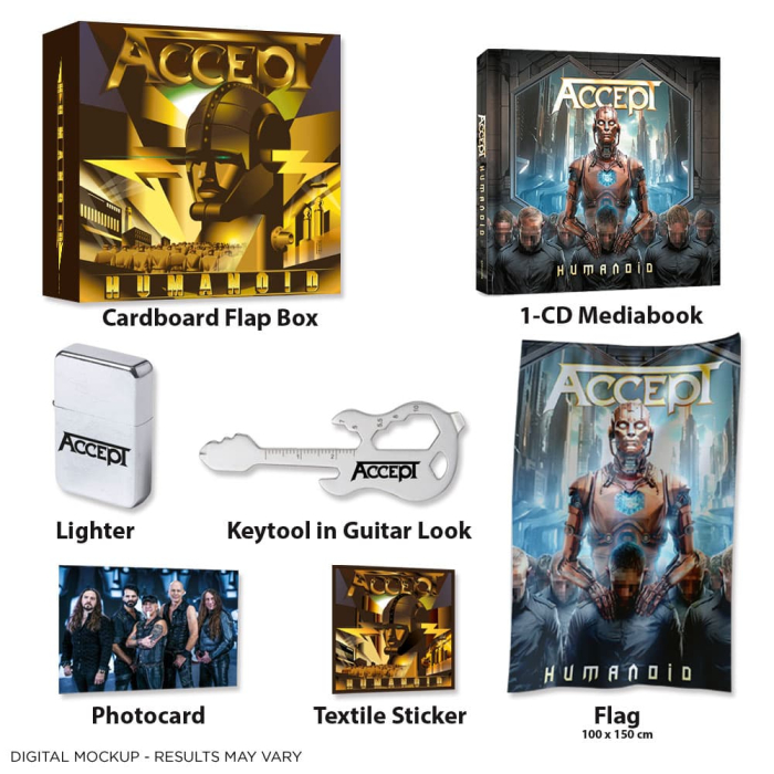 |
|
|
|
Post by John on Apr 9, 2024 7:26:48 GMT -5
not really a fan of either. i don't think i'd want a t-shirt with either design on it. but if i had to pick which one i disliked the least, i would probably agree with you on the gold artwork.
|
|
|
|
Post by Tomcat on Apr 10, 2024 3:40:49 GMT -5
The style of the yellow one (art propaganda) is what Wolf wanted to use already on the cover of Stalingrad - but the management, the recordcompany or whoever didn't like the idea.  Neither I like any of the two. I don't get what is the point in reusing the metal heart again and again. Plus I still prefer photos as ACCEPT albums' covers. |
|
u94
Freelance Man
Posts: 59
|
Post by u94 on Apr 11, 2024 11:24:07 GMT -5
I think gold box is more of a 1930s, stylized futuristic design close to the film Metropolis. The gold just pops more. The regular cover has a washed out blue tint that reminds me of 'The Rise of Choas' + of course the recycled metal heart design.
|
|
|
|
Post by mika on Apr 11, 2024 15:47:35 GMT -5
The style of the yellow one (art propaganda) is what Wolf wanted to use already on the cover of Stalingrad - but the management, the recordcompany or whoever didn't like the idea. Neither I like any of the two. I don't get what is the point in reusing the metal heart again and again. Plus I still prefer photos as ACCEPT albums' covers. I prefer photos too. But as for Metal Heart...there is some Tshaikovski there on the title track. Accpet album covers as photos were cool back in the day: the best being Restless And Wild. |
|
|
|
Post by mika on Apr 11, 2024 15:49:04 GMT -5
The style of the yellow one (art propaganda) is what Wolf wanted to use already on the cover of Stalingrad - but the management, the recordcompany or whoever didn't like the idea. Neither I like any of the two. I don't get what is the point in reusing the metal heart again and again. Plus I still prefer photos as ACCEPT albums' covers. Maybe Gaby was opposing. She is a very clever person. I like her very much. |
|
mf
Sweet Little Child
Posts: 17
|
Post by mf on Apr 12, 2024 5:17:51 GMT -5
|
|
|
|
Post by Tomcat on Apr 13, 2024 15:37:14 GMT -5
I think gold box is more of a 1930s, stylized futuristic design close to the film Metropolis. The gold just pops more. The regular cover has a washed out blue tint that reminds me of 'The Rise of Choas' + of course the recycled metal heart design. I think you're right. It rather is in the style of Metropolis than in art propaganda. |
|


 I do hope you will find the same satisfaction as I do. I cannot find the same depth in the solos as in Sucks to be you. However...if not, someone does not look the melodic solos in the way of the songs as I do.
  I love Accept.


